This (above) is a dumb composition, isn't it? I mean that as a compliment. It's for a comedy so the art director wisely violated the normal rules of composition. The picture's too symmetrical, too much attention is paid to the tablecloth, and the three doors are distracting...but so what? It's funny.
I
LOVE ignorant staging!
You don't always need funny sets to make live background elements funny. It's about how you shoot them and light them.
Here's (above) two ways to shoot a cup, the normal way and the funny, ignorant way. The cup on the left looks fine, but you'd call it dignified, rather than funny. In the world of cups it's a solid citizen, a device that earns its way by being useful to humans, a cup whose mother is proud of it...but it's not funny.
The cup on the right however, the one in the wide shot, is lonely and insecure, and maybe something of a klutz. He's probably always spilling things on humans. How do we know? Because the world he inhabits is so awkward. The ocean of empty space around the cup, the funky table, the lip of the table and the awkward area underneath...it all says that this silly cup hasn't got the brains to sit closer to the camera. He's funny.
BTW, I'm glad the art director didn't show too much detail in the cup background. Too much detail would have hinted at a larger story, and taken our attention away from the simple ignorance of the situation.
Study the deliberately ignorant and theatrical staging (above) in silent comedies. It just shouts, "This is a funny picture!"
Too many people assume that sets were made this way (above) because the films were made in a primitive time, when nobody understood composition. That's not true. Old timers understood composition at least as well as we do now. They simply thought this way of doing things was funnier..
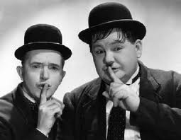
Even the lighting (above) was ignorant in those days. Lots of film people knew how to light properly, but comedians favored frontal lighting, which flattened out the face and gave it a cartoony, graphic look.
Stan Laurel insisted on in it in the early films he did with Hardy.
Later he allowed very light shadows on one side. Other actors in their films were allowed to have deeper shadows, but not the two stars.
Still later, they were forced to use the same stark lighting that dramatic actors used. By then, producers were insisting that comedy people conform to dramatic rules.
By luck or intentional skill, early TV used the kind of flat lighting that we saw in some silent comedies. It made everything more funny.
Lighting wasn't the only thing that was funny in early TV. The sets were funny too. You can see the influence of old silent comedy staging.
Me, I think that ignorant composition is bliss.
BTW: Mike's the biggest Laurel and Hardy fan that I know, and he wrote the following comment:
"When Laurel & Hardy - whom I revere - left Hal Roach Studios in 1940 to move to 20th Century Fox in '41, they seem to age 20 years overnight. This was the direct result of the new studio's intrusive and insensitive meddling with the team.
Fox, who seem to have been as determined to ruin Laurel & Hardy as Paramount was to ruin Popeye (and MGM was to ruin Keaton, Our Gang and the Marx Brothers), insisted on uniformly realistic makeup and lighting in all their films. It didn't matter if it was a drama, musical or slapstick comedy - an approach about as individual as a cookie cutter.
Laurel instinctively knew the team needed stylization to be believable in the special world they created and inhabited. Besides keeping them young - and preserving the comic illusion that they were overgrown children - the subtle clown-white makeup the team had been using since their silent film days also kept them slightly cartoony, and that much more removed from harsh reality. Stylized sound effects, lively music and flat lighting accomplished the same feat, exactly what the team needed, and had had at Roach.
Of course, the front office couldn't resist tampering with the scripts as well, and their literal, assembly line, sausage factory approach was exactly opposite to what L&H had been used to up until that time. These are just some of the reasons why the boys are still delightful to watch in Saps as Sea, their last film shot at Roach in 1940 - and already old and tiresome in Great Guns, their first one made at Fox only one year.
Unfortunately, corporate interference with creative artists is just as destructive now as it was then. In the words of Scotty Beckett: 'They'll never learn...' "