Showing posts with label cliff may. Show all posts

Wednesday, June 07, 2017

CHEERFUL INTERIORS

I'm still looking at pictures of home interiors and I thought I'd share a few that I like. How do you like this open plan kitchen and dining room?


I like arched ceilings but there are few of those where I'll be moving.


Craftsman furniture would be nice...it's pricey, though.


I like how a lot of designers have merged Craftsman with Modern. And, do you like those black foreground chairs? The ones I've seen are expensive.


Here's (above) a California Ranch-Style back porch, the kind my favorite L.A. architect Cliff May would have approved of.


Big canvas awnings look great, though this example seems a bit flimsy. What happens when the wind blows?


Haw! A blackboard wall! You'd breathe a lot of chalk in a room like that, but it might be worth it.  You could draw life size caricatures of your family and friends seated at the table, eating and squabbling with each other.


And jasmine curtains...a nice way to cheer up a gloomy room.


Monday, February 13, 2017

THE HOUSE FROM "LEAVE HER TO HEAVEN"


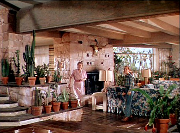
Architecture is on my mind these days, and I thought I'd talk about another favorite film house...this one from the 1945 thriller, "Leave Her to Heaven."  The stars: Gene Tierney and Cornel Wilde.  The director: John M. Stahl.  The location: Arizona.  Gee, I wish I knew the art director's name because this post is really about his work. 


This (above) is the best view of the exterior I could find, but it doesn't quite match the log cabin look of the picture at the top. I think the film presented these as different views of the same house, though. Anyway, this view kinda' makes you want to take a dip, doesn't it?


And here's an indoor shot highlighting one of the best staircases in all of film. It's only rival...in my opinion... is the Czar's staircase in Von Sternberg's "Catherine the Great."


This interior was built on a set in L.A. If I understand right
it was inspired by a real house in Arizona, but lots of alterations were made by the set designer.  Not bad, eh?


Above, a slightly different angle.


This house (above) is cozy as well as modern. That's a trademark of architect Cliff May. You don't suppose he had a hand in this film, do you?


The dining area (above) is raised two or three steps above the living room. Nice.


Of course, it helps to have Gene Tierney serving up the meal.


Above, the area in front of the dining table.


Here's (above) the set of another house in the film.


How do you like the Dutch door and the large windows that go all the way down to the floor?

BTW: Most of these pictures were found on a site called "Hooked on Houses."

Saturday, January 02, 2016

BEDROOM DESIGN


Here's (above) a bedroom from Frank Lloyd Wright's Heart Island House. What do you think of it? For me it's too formal, too much like a terrific living room that just happens to have a bed in it. It lacks..."bedroomness." Wright was a peerless designer of living rooms but his imagination failed him when it came to bedrooms and kitchens.


 Ditto for Cliff May, another of my favorite architects. Bedrooms seem to have bored him. This one (above) looks like he devoted no thought to it at all.


For good bedroom ideas I find myself turning to less well-known designers. What do you think of this dark, low ceiling bedroom (above)? It's cozy and fun...evocative, too. It's like a Goldrush cabin in the Klondike or the Captain's quarters of an old 19th Century sailing ship.

I like to imagine that this room is one or two steps down from the level of the rest of the house, and that prompts an interesting question: is it a good idea to graft a cool historical bedroom onto a stylistically modern house? I'd say yes, but lots of people would disagree.


I like this (above) well-lit Ikea bedroom. I don't like what looks like a plain particle board cupboard on the extreme left, but the general layout seems fine. You can't see it from this angle but the headboard of the bed is a bookshelf on the side that faces the window. There's room to walk back there.


Here's a modest but still cozy bedroom idea, also from Ikea. It's cheery and even pleasingly austere, as if a nun sleeps there. Once again the lighting makes a big difference.


Friday, November 13, 2015

MODERN FURNITURE

I'll be moving in a few months and I won't be able to take half my heavy furniture. That means I'll have to buy a few new things when I get where I'm going and that's exciting. 

I plan to go for an eclectic blend of Charles Eames knock-offs (that's his work, above), Wright, Indiana Jones, Cliff May, Craftsman, Wally Wood, Mad Scientist, Calder and Carl Larsson. At one time or another I've blogged about all these influences on Uncle Eddie's Theory Corner, and now I get to try out some of these ideas in my own house.   


Lately I've taken a close look at modern furniture. Some ideas stand up to scrutiny and some don't. Like Mies van der Rohe's famous "Barcelona Chair" (above): I have to admit, it looks great, but...wait a minute... there are no arms! I like to rest my forearm on something when I sit, don't you?


I might give in and get just one Barcelona chair as an accent, but then I'll be sorely tempted to get an armless sofa to go with it. I'll need to steel myself to avoid that lest my living room look like a reception area.

Besides, I like to lie down and read on the sofa or even take a short nap there once in a while, and you need an arm for that. Why would anyone design a sofa without arms?


Then there's the Noguchi CoffeeTable. It's a beautiful work of art, no doubt, but is it functional?

 In the picture above, the table top is triangular and only the tip containing the green ashtray faces the sofa. That can't be right. What if someone on the far end of the sofa (off screen) wants to use the table? They can't.

If you turn the table around then the people sitting opposite get the awkward tip. Yikes! And look at the awkward dead space that surrounds the table!


Compare the triangular Noguchi Table just discussed to the rectangular, red marble coffee table above. I like this thing. The broad surface is available to everyone on the sofa, and there's plenty of room to stack the books I always have going. Marble adds psychological weight to counter the fear that the modern supports are too thin and flimsy.

 By the way, what do you think of the Windsor chairs surrounding the dining table in this picture? My current table uses chairs like that, and they've given me years of pleasure. It's a centuries-old design that still works. My only criticism is that the ones shown here all have arms which would be hard to slide under the table without pinching fingers.


Maybe I'll get lucky and find a new home with built-in bookshelves. If I can't then I'll rely mostly on a combination of George Nelson-type shelves (above), Ikea's "Billy" shelves, and some custom shelves that I'll tinker together myself. Eames made some good shelves which Nelson tweaked and improved.


George Nelson was a prolific artist. You might already own something he designed without knowing it...like his sunburst clock or this asterisk clock (above).


Nelson's designs have a light and airy modern feel and they blend well with other styles, like the fabric pattern above.

Well, there's more I could say but I'll have to save it for another post.


Tuesday, September 29, 2015

A CONTEMPORARY LIVING ROOM

I love the updated craftsman-type houses (above) that are popular now. They're pricey, though. All that wood and stone...the irregular room shapes, the architect's fee...they don't come cheap. Fortunately a number of neo-craftsman innovations have been incorporated into other more affordable styles, and I thought I'd discuss that here. 


For comparison here's the home of a friend. The house has a good vibe and my friend and his wife like living there. I see Mediterranean, craftsman, ranch and post-modern influences. I even see a little Cliff May and Frank Lloyd Wright.

The two posts are Craftsman. The ultra wide living room entrance/central corridor is Cliff May and the vestibule area is post-modern. I don't know who invented the sunken living room but I'll attribute it to Wright because he introduced so many similar ideas.


This view (above) is from the front door area looking into the central corridor. To the left we see a hint of the dining room and to the right we get a glimpse of the kitchen.

The pillars look like an obstacle in the photo but that's because I didn't photograph them well. In reality they come off as playful and even sheltering.

The very latest house theories would have the kitchen entrance at the end of the corridor rather than off to the right, but the right access is a nice counterpoint to the rest of the house so it works for me.


The dining room (above) is raised above the sunken living room and that works just fine. The steps look like something you'd trip over but I'd be surprised if anyone ever did. The raised floor lends importance and a sense of fun to the dining room and the abundant daylight makes it very inviting.

I'll bet lots of people sit on the steps during house parties.


I only have room for one more photo, so I'll put up this one, showing the door and darkened vestibule area. This probably suits my friend who has to stare into a brilliant computer screen all day, and no doubt welcomes a little rest for the eyes. Me, I don't have that problem right now so I'd opt for more light.

I'd put translucent glass panels all around the door. The light would bounce off the nearby walls as if they were additional light fixtures, and probably unpredictable mood lighting would result. Of course the neighbors would think I was crazy for undoing something that worked fine at the start.


Tuesday, June 02, 2015

LOW COST HOUSING: CLIFF MAY

The subject is Cliff May again. I thought I'd discuss May's efforts to create low-cost housing. We know May could build wonderful ranch houses when he had a decent budget and room to spread out. Now let's see what he could do with tract houses on small urban lots.

Here's (above) one of May's smallest living rooms. It looks large because a sliding glass door has been opened and the patio's been made to look like part of the living room. Both have the same floor color and similar furniture. To heighten the effect the board and baten outdoor fence is made to look like an indoor wall. A nifty idea, eh? Of course this open wall solution only works in the sunbelt where winters are mild.

By the way, that fire pit on the patio floor (above) is for real campfires. There's no fireplace. Maybe that would have cost too much.


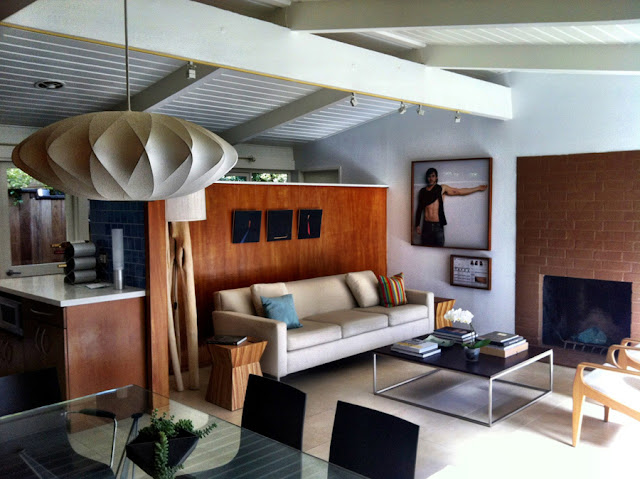
Here's (above) a different Cliff May house and an even smaller living room. Here the kitchen, living room and dining room are all in one enclosure. Like I said, this is a small house!

The partition behind the couch is oddly high and intrusive. It dominates the room. I'm guessing it's there because May needed space for kitchen cupboards. He couldn't put them against the glass wall facing the yard because that would have violated his belief about the need to bring the outside in. I'll bet May regretted this decision.

One last comment: Maybe May went too far in his effort to cut costs. The upper wall above the fireplace, the area just under the roof, cries out for glass. Whatever the cost it would have been worth it.


In the color photograph above we don't see the wall opposite the sofa. I like to imagine that it looked like this one (the b&w photo above) from yet another May house: louvered wall panels that open up and out during the warm weather, and which can be easily lowered when it gets cold. In the "up" position walls like this can be made to look like extentions of the roof.

And how do you like the wide steps in the back yard? That's an interesting idea, too. It makes the yard seem larger. And are the lounges in the yard deliberately smaller than normal?


I absolutely love Cliff May's designs but I have to admit that he didn't really solve the low cost housing problem. That's okay, Frank Lloyd Wright couldn't solve it either. In fact, some 60+ years later we're still wrestling with it.

We do have one advantage that architects in May's time didn't have, and that's the availability of a wide variety of small, scaled-down furniture, like the kind in the IKEA promotion above. Maybe ours will be the generation that makes the low cost breakthrough.
   

Friday, May 29, 2015

THE EVOLUTION OF THE MODERN HOUSE

Here's (above) a 1950s-type Cliff May-influenced ranch house. They're not uncommon in Los Angeles, in fact they're so common here that they hardly raise an eyebrow. That's a pity because this city's ranch homes are much underrated. They so effortlessly combine modernism and tradition that we forget how hard won that synthesis was.

A little history is in order: 

  
Europeans created modernism but they couldn't make it work. Look at this bleak design (above) for a reconstructed Paris by Le Corbusier. Parisians can thank their lucky stars that he was prevented from putting this into effect. 

Here's a factory-style house by ex-Bauhaus teacher Walter Gropius. What was he thinking of? Who wants to live in a factory?


The public liked the modern look but only for business buildings. They didn't want to live in it. The race was on to tame modernism and make the new style fit for homes, and affordable. The first American efforts (above) were hideous.


Haw! So were the second efforts (above).


Sure, Frank Lloyd Wright (above) could make it work but he built for the well off. How do you make this sort of thing available to the common man?


Eventually a potentially low cost Wright-influenced look was achieved (above) but the look required a house that was big enough to spread out a bit, sympathetic building codes and readily available pre-fab parts. I'm also guessing that the designs, as good as they were, were perceived by the public as too drastic. 
  

During this period faux modernism proliferated. In the kind of small houses most people could afford it sometimes looked shoddy and tacky...something built for the convenience of the contractor rather than for aesthetic reasons.


The guy who finally made it work was Cliff May (above). His smaller houses weren't exactly cheap and they still required a certain amount of square footage, but they were simultaneously modern and traditional, conceptually simple, and they left the door open for further simplification.


Here (above) there's a gap in my knowledge. Some genius...was it May or one of his disciples?...created the synthesis known to Southern Californians as "The Yellow Ranch House." It's affordable, Cliff May savy, modern, comfortable, compressible, can be built on a small lot...and it's low priced! No reliance on esoteric materials; every component is made of parts that can be had at any large lumber store.

It's the perfect realization of the maxim: "it doesn't have to look modern to be modern."

Boy, Cliff came through for us! He was the Bob Clampett of modern housing!


I'm amazed by the versatility in the interior design of these yellow ranch houses. You can furnish them almost as modern as you like without contradicting the house's design.


A less modern decor (above) works okay, too.


In fact, I'll bet even funky furniture like the kind in this TV set would work in those yellow ranch houses.

Thanks, Cliff! You 'da man!!!!