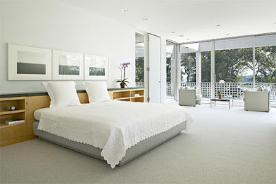
Well, to begin with, we all know Wood is fond of tight spaces. He uses perspective cheats to make them appear more spacious, and that's a great technique. His spaces are simultaneously wide and cramped. There's no reason why real architecture can't do this.
Of course a home consisting of nothing but tight spaces would be claustrophobic. I like the way Wood opens up the space in front of the entrance. Immediately upon entering the house (or is it an apartment?) you're confronted with a choice: whether to walk down into the living room or up onto the second floor. From the vantage point of the door both choices are visible and enticing.
I know what you're thinking...that some modern architecture (sample above) already does all that...but does it? The examples I've seen are usually botched, like the bed above. Granted, it sits on a level or a ledge of sorts but it's lost in a gigantic, impersonal space. None of Wood's sheltering here.
For contrast, observe how Wood handles his levels (above). The levels resemble solid blocks. They seem to protect the girl sleeping in the single bed at the bottom of the stairs. I'm guessing that's a guest bed, which is also useful for reading and lounging in the middle of the day. Spacious closets could be hidden in the blocks. There's actually a lot of potential closet space here.
The sleeping hipster on the top level sacks out on the comfortable wall-to-wall carpet that covers the floors, stairs and walls. Currently wall carpets are dust traps, and are probably unhealthy, but the day can't be far off when the right material will make them practical.
Most modern architects are too fond of empty space (above). Wood seldom made that mistake.
Here's a large space that almost works. It would work a lot better with a low, nurturing, Wally Wood ceiling that would emphasize the wideness of the room.
Sigh! There's more to say on this subject, but it'll have to wait til after Christmas. I've got presents to wrap!
Let me lay on you........


2 comments:
I would love a Wally Wood house. I've always prefered interesting cozy places like this. Those big open rooms always feel cold (emotionally) and too empty. However, at the same time I hate clutter so, some sort of solution would have to be devised as I could imagine a Wally Wood house could easily get cluttered with too much unnecessary decor. Of course every Wally Wood home would have to come with a sleeping beauty in the guest room.
Merry Christmas, Eddie! Once again, I didn't really get any presents (though I'm going on a nice trip to New York this week to compensate for that matter, and the promise of a better year), because my family isn't in the financial position to be spending too much on anything, but I'm very grateful for my family and friends that I have. These Wally Wood drawings, as I said before, are really nice and I always like it when you dissect this kind of stuff.
Post a Comment